The 4-Color Rule That Interior Designers Use to Create Old Money Rooms on Any Budget
The Quiet Power of Color — What Wealthy Interiors Never Tell You
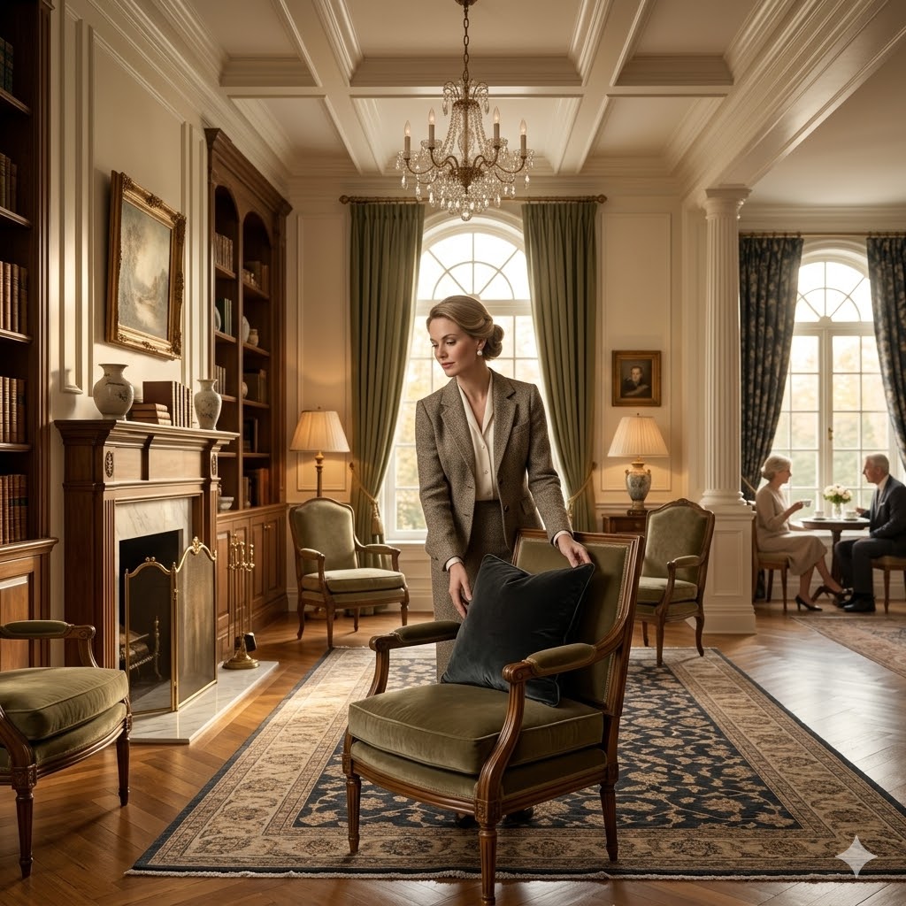
The old money home decor aesthetic is one of the most quietly powerful design languages you will ever walk into.
You step through the front door of a beautifully aged townhouse or a sprawling countryside estate, and something immediately tells your brain — this is different.
It is not the chandelier, not the size of the rooms, and certainly not any flashy artwork screaming for your attention.
It is the color on the walls.
It is the shade of the linen drapes pooling softly onto the floor.
It is the tone of the trim around the doorframe, the hue of the upholstered armchair sitting quietly in the corner.
These things work together in a way that feels almost effortless, like no one tried too hard, because in an old money home, trying too hard is the one thing that never happens.
If you have ever wondered why certain homes feel expensive even before you notice a single piece of furniture, you are about to find out exactly why.
We strongly recommend that you check out our guide on how to take advantage of AI in today’s passive income economy.
Table of Contents
The Psychology Behind the Old Money Home Color Palette
Before we talk about the specific shades, it helps to understand the thinking behind them.
The old money home decor aesthetic is built entirely on the principle of quiet strength.
Wealthy homes — and we are talking about generationally wealthy, not lottery-winner wealthy — have always favored colors that communicate without shouting.
Think about what you picture when someone says old money home.
You do not picture a bright cobalt blue accent wall or a vivid orange kitchen island.
You picture warm, muted tones that feel like they have been there for decades and somehow look better every year.
That is exactly the point.
Flashy colors go out of fashion fast.
A bold neon-yellow cushion that feels trendy in January looks tired by October, and it takes your whole room down with it.
Old money interiors are designed to resist time, not chase it.
The colors used in these homes are connected to permanence, restraint, and understated refinement — values that have defined high society interior design for centuries.
Interior design experts and color psychologists consistently point to muted, earthy tones as the shades most associated with calm, confidence, and sophistication.
These are not colors that scream look at me.
They are colors that whisper I have been here for a very long time, and I am not going anywhere.
The 4 Core Shades of the Old Money Home Decor Color Palette
Shade 1 — Warm Ivory and Aged Cream
The first and most foundational color in the old money home decor color palette is not white.
True white — the bright, stark, freshly-painted kind — actually works against the old money aesthetic.
What you want is warm ivory or aged cream.
Picture the color of thick linen curtains that have been gently sun-kissed over years.
Picture the tone of old book pages, or the inside of a vintage oyster shell.
That warm, slightly yellowed off-white is the base that holds everything else together in an old money room.
It is a color that makes rooms feel lived in, comfortable, and quietly luxurious all at once.
On walls, warm ivory creates a sense of spaciousness without the sterile coldness that pure white often brings.
On furniture upholstery — particularly on sofas, armchairs, and headboards — aged cream suggests a kind of heirloom quality that money cannot simply buy in an afternoon.
The old money home decor aesthetic relies on this shade as its neutral canvas, the backdrop against which every other color in the room can breathe properly.
Designers like Kelly Wearstler and Bunny Williams, two of the most respected voices in American luxury interior design, have long used warm ivory and cream tones as their foundational palette choice in high-end residential projects.
Shade 2 — Charcoal and Deep Slate Gray
The second pillar of the old money home decor color palette is charcoal — and it is one that most people underestimate.
Charcoal is not black.
This distinction matters enormously.
Solid jet black in an interior, while dramatic, can feel too severe, too fashion-forward, and a little too much like it is trying to make a statement.
Charcoal, by contrast, is black’s more refined, thoughtful older sibling.
It carries the same depth and gravity as black, but it is warmer, softer around the edges, and far more livable over the long term.
In an old money home, you will find charcoal on library bookshelves painted in a deep slate finish.
You will find it on window frames, on kitchen cabinetry, and on the accent walls of formal dining rooms.
You will find it in the pile of a heavy wool rug anchoring a sitting room, or in the upholstery of a Chesterfield sofa in aged leather.
Charcoal creates a sense of weight and groundedness in a room.
It says this space has substance, this space has history, without ever raising its voice.
Farrow and Ball, the British paint company renowned for supplying colors to some of the most prestigious homes in England, produces several versions of charcoal and deep gray that have become quietly iconic in luxury interior design circles.
Their shade Mole’s Breath — a deep, warm, brownish gray — is one of the most frequently referenced colors in old money British interiors specifically because of how effortlessly it communicates age and elegance.
Shade 3 — Deep Forest Green and Aged Sage
The third shade in the old money home decor color palette is green — but not just any green.
Forget bright lime, forget mint, forget anything that feels fresh off a grocery store shelf.
The green of an old money home is deep forest green or aged sage, and the difference between these two shades gives you a surprising amount of design flexibility.
Deep forest green is the color you associate with an old English estate library.
It is dark, rich, and velvety in quality.
Picture dark green walls lined floor to ceiling with leather-bound books, a mahogany desk positioned beside a tall sash window, warm lamp light glowing against the green.
That is deep forest green in its natural habitat.
Aged sage, on the other hand, is softer and more muted — a green that has been toned down with gray until it reads almost like a neutral.
This is the green you find in a beautifully appointed bedroom, or in a kitchen where hand-painted cabinetry in a dusty sage color sits beside marble countertops and aged brass hardware.
Both versions of green carry the same essential quality — they feel organic, timeless, and deeply rooted in the natural world.
Interior design researcher and writer Architectural Digest has documented repeatedly how deep greens dominate the color palette of heritage homes across England, France, and the American Northeast — regions where old money aesthetics have been cultivated over generations.
Green, in these muted, aged forms, is a color that makes a room feel like it has always existed exactly as it is.
Shade 4 — Deep Navy and Midnight Blue
The fourth essential shade of the old money home decor color palette is navy blue, specifically deep navy or its slightly more complex cousin, midnight blue.
Navy is one of those colors that never goes wrong in a well-designed interior.
It is sophisticated without being cold, bold without being loud, and it pairs beautifully with almost every other color in this palette.
In an old money home, deep navy shows up in unexpected and quietly stunning ways.
A navy blue lacquered ceiling in a dining room.
A navy linen sofa positioned against walls painted in aged cream.
Navy velvet cushions piled onto a pale ivory daybed near a sunlit window.
Navy board and batten paneling in an entryway that transitions to warm wood flooring.
Midnight blue is the more mysterious variation — in certain lighting conditions, it reads almost as black, but in natural daylight it reveals a deep, rich blue that adds layers of depth to any space.
This particular quality of midnight blue is what makes it a favorite in rooms used in the evening, like formal dining rooms or sitting rooms where candlelight and warm lamp glow bring out the richness of the color.
Interior designer Mark D. Sikes, known for his work on some of America’s most celebrated high-end residential projects, has built an entire design identity around deep navy and its relationship to classic American and European old money interiors.
How the Old Money Home Decor Color Palette Actually Works Together
Understanding the four shades is one thing.
Understanding how to use them together is where the real magic of the old money home decor color palette lives.
The key principle here is the 60-30-10 rule, a foundational concept in professional interior design.
Sixty percent of the color in any given room should be your dominant shade — in an old money home, this is almost always warm ivory, aged cream, or a muted neutral on the walls.
Thirty percent is your secondary color, used on upholstered furniture, larger rugs, and window treatments — this is where your charcoal, navy, or deep forest green enters the room.
Ten percent is your accent color, used on cushions, throws, decorative objects, and smaller accessories — this is where a touch of deep burgundy, aged brass, or muted mustard can create that final layer of richness.
The three-color rule is equally important — never introduce more than three colors into a single room simultaneously.
This is not a limitation.
It is a discipline that creates visual calm and prevents the kind of busy, cluttered feeling that immediately reads as amateur.
An old money room never looks like it could not decide what it wanted to be.
It knows exactly what it is.
What Colors the Old Money Home Decor Aesthetic Always Avoids
Just as important as the shades you choose are the shades you leave out.
The old money home decor color palette has a very clear set of colors it does not use.
Bright whites — cool, blue-toned, freshly-painted white — feel corporate and lacking in warmth.
Neon or highly saturated colors of any kind immediately read as trend-chasing, and trend-chasing is the opposite of what old money represents.
Bright red, whether on walls or in large furniture pieces, is too aggressive and attention-seeking.
Cool gray with blue undertones — the kind that dominated minimalist interiors for the better part of a decade — feels too modern and too cold for an old money space.
Anything that draws attention to itself rather than contributing to a whole is out of place in this palette.
The guiding principle is always the same: does this color whisper, or does it shout?
If it shouts, it does not belong here.
Seasonal Adjustments Within the Old Money Color Palette
One of the most elegant features of the old money home decor color palette is how it adapts across seasons without ever abandoning its core identity.
In warmer months, the palette shifts toward its lighter expressions.
Warm ivory walls feel airy and luminous in summer light.
Aged sage cushions and natural linen throws bring a breezy freshness to sitting rooms.
Light, bleached oak floors and woven rattan accessories soften the deeper anchor colors and create a sense of ease.
In colder months, the palette deepens and enriches.
Deep forest green walls feel cocooning and warm in a room lit by table lamps and a fireplace.
Navy velvet throws draped over a cream sofa create an instant sense of luxury and warmth.
Charcoal wool rugs anchor rooms in a way that feels both visually grounding and physically warm.
The old money home decor approach never chases seasonal trends.
It simply deepens or lightens the same core palette, the way a great cashmere sweater in winter and a fine linen shirt in summer are both expressions of the same underlying taste.
How to Start Building This Palette in Your Own Home
You do not need to own a country estate to use the old money home decor color palette.
You need a plan, a disciplined eye, and a willingness to resist the temptation of color that feels exciting in the store but exhausts a room within a year.
Start with your walls.
Choose a warm ivory or a soft aged cream and commit to it as your dominant tone.
Farrow and Ball’s Pointing, Benjamin Moore’s White Dove, or Sherwin-Williams’ Antique White are all widely available options that capture the warm, unhurried quality of the old money base tone.
Next, identify one secondary color from the palette — navy, charcoal, or deep forest green — and bring it in through a large piece of furniture or a bold window treatment.
Finally, choose a single accent color and use it sparingly in cushions, artwork, and decorative objects.
Keep the textures natural — wool, linen, aged leather, brushed brass, raw wood.
These materials carry their own quiet luxury, and they work in complete harmony with the four shades of the old money home decor color palette.
Conclusion
Rooms that feel genuinely wealthy rarely got that way by accident.
They got that way because someone understood that color has a psychology, and that the most powerful colors are almost always the ones that say the least.
The old money home decor color palette — built on warm ivory, charcoal, deep forest green, and navy — is not a trend.
It is a design language that has been refined over centuries, tested in some of the most admired interiors in the world, and proven to only get better with time.
Use these four shades with discipline and patience, and your home will carry that same quiet, unshakeable sense of elegance that no amount of bold color or flashy design can replicate.

We strongly recommend that you check out our guide on how to take advantage of AI in today’s passive income economy.