
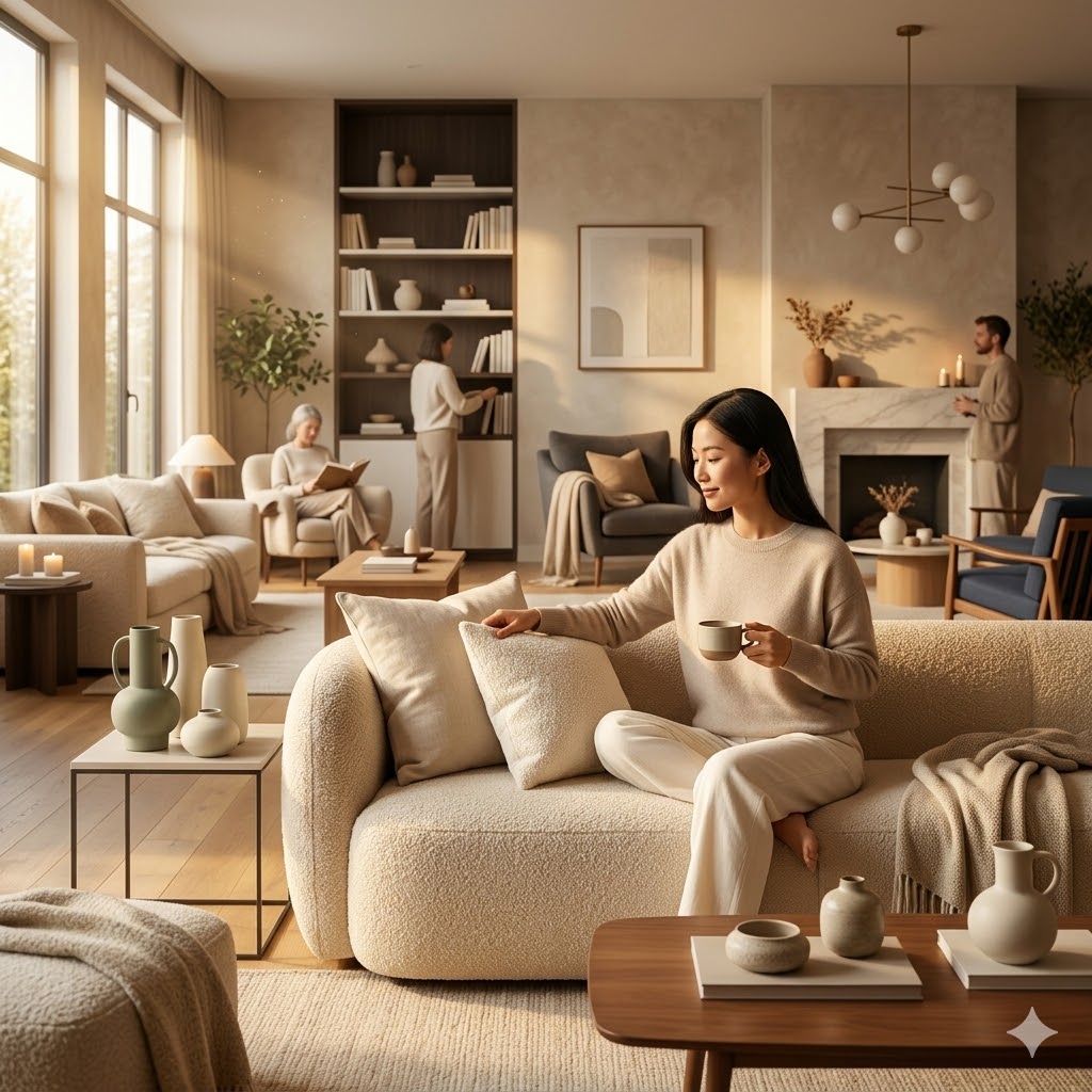
6 Paint Colors That Give Your Minimalist Living Room a Warm, Cozy Upgrade
Why the Right Color Changes Everything in a Minimalist Living Room
Your walls are talking, and they are saying a lot more than you think.
Walk into a room painted the wrong shade, and something just feels off — even if you can not put your finger on why.
Walk into one painted just right, and you exhale without even realizing it.
That is the quiet power of color.
A cozy minimalist living room color scheme is not about choosing something pretty on a paint chip under a store’s fluorescent light.
It is about choosing a color that holds its own through morning light, evening lamplight, sunny afternoons, and overcast Tuesdays.
It is about finding the shades that can sit beside your cream linen sofa just as easily as they can sit beside your dark wood bookshelf.
Most colors can not do that — but these six can, and they do it beautifully every single time.
We strongly recommend that you check out our guide on how to take advantage of AI in today’s passive income economy.
Table of Contents
What Makes a Color Truly Versatile?
Before we get into the six color schemes, it helps to understand what actually makes a paint color work across different home styles.
A truly versatile color for a cozy minimalist living room color scheme does three things exceptionally well.
First, it responds intelligently to changing light — it does not turn yellow in warm afternoon sun or look icy blue under cool overhead lighting.
Second, it plays well with other colors, textures, and materials without stealing the room’s personality or fading into the background.
Third, it feels emotionally consistent — meaning the room feels calm and inviting whether you are sitting in it at 8 in the morning or 9 at night.
When a color checks all three of those boxes, you have found a real MVP.
The six colors below do exactly that, and each one brings something unique to the table for your living space.
The 6 Cozy Minimalist Living Room Color Schemes You Need to Know
1. Classic Gray by Benjamin Moore — The Quiet Powerhouse
If there is one color that has earned its spot at the very top of a cozy minimalist living room color scheme conversation, it is Classic Gray by Benjamin Moore.
Here is the thing about Classic Gray — it is not exactly gray and it is not exactly white, and that is precisely what makes it so remarkable.
It lives in that soft, gentle in-between space that feels warm enough to add texture and depth to a room, but neutral enough to never overwhelm.
The subtle violet undertone in Classic Gray is the real magic behind its versatility.
That slight violet cast prevents it from pulling yellow under warm, golden lighting — and it equally stops it from reading icy or cold under cooler, north-facing light conditions.
Imagine your living room on a bright summer morning, walls bathed in warm natural light, and the color still looks calm, grounded, and inviting — not washed out, not orange.
That is Classic Gray doing what it was born to do.
Interior designers consistently reach for this shade in open concept floor plans where color needs to flow from the living room into adjoining spaces without creating a jarring visual break.
It acts like a beautiful, breathing canvas for everything else in the room — your art, your textiles, your furniture, your plants — without competing with any of it.
Benjamin Moore’s Classic Gray (OC-23) is available at Benjamin Moore retailers and authorized dealers worldwide, and it pairs beautifully with the brand’s Chantilly Lace OC-17 on trim and ceilings for a clean, elevated finish.
2. Swiss Coffee by Behr — The Creamiest Warm White That Feels Like Home
Swiss Coffee by Behr is one of those rare paint colors that has been quietly trending for years without ever feeling overexposed or tired.
It is a warm white — but not in the way that tips into yellow or starts to look dingy after a few months.
Swiss Coffee carries just enough creaminess to feel soft and welcoming, and it has a surprising depth to it that becomes especially beautiful in natural daylight.
Think of the way late morning sunlight filters through sheer linen curtains onto a cream wall — that soft glow, that quiet radiance — that is the feeling Swiss Coffee delivers on a well-lit wall.
What makes it such a standout for a cozy neutral minimalist living room color is the way it adapts so fluidly to whatever you pair it with.
Pull in matte black accents and the room takes on a bold, sophisticated edge.
Layer in warm-toned wood furniture and reclaimed oak shelving, and suddenly the space feels rustic, grounded, and deeply cozy.
Add brushed gold hardware and a veined marble side table, and Swiss Coffee shifts effortlessly into modern organic territory.
Behr’s Swiss Coffee (PPU5-12) is available at The Home Depot, where Behr products are exclusively stocked, and it works beautifully not just on walls but also on trim, doors, and ceiling joinery for a seamless, envelope-style interior finish.
3. Shiitake by Sherwin-Williams — The Mushroomy Grayge Nobody Talks About Enough
Shiitake by Sherwin-Williams might be the most underappreciated color on this entire list, and that needs to change in 2026.
It is a warm mushroom-toned greige — that beautiful hybrid of gray and beige — with just a touch more depth than the softer, lighter neutrals that tend to dominate the cozy minimalist living room color scheme conversation.
And that extra depth is exactly what sets it apart.
In rooms that receive abundant natural light — think south-facing walls in open-plan living spaces — a very pale neutral can look completely washed out by midday, losing all its warmth and visual interest.
Shiitake holds on beautifully in those conditions.
Its earthy mushroom undertone keeps the color feeling grounded and calming without ever tipping into heavy or dark territory, which makes it exceptionally easy to live with.
Picture a living room with wide plank white oak flooring, matte black light fixtures, a linen sofa in warm oatmeal tones, and walls painted in Shiitake — it is the kind of room that feels like it was styled by a professional but lived in by a real family.
Shiitake also works remarkably well in more traditional homes with dark wood trim, crown molding, and classic furniture profiles, bringing those spaces into a more contemporary feel without losing their architectural character.
Sherwin-Williams Shiitake (SW 9173) is available at Sherwin-Williams stores and their authorized paint retailers, and it coordinates beautifully with their Accessible Beige (SW 7036) and Pure White (SW 7005) for a layered, cohesive whole-home palette.
4. Smoky White by Behr — The Understated Texture Lover
Behr’s Smoky White is the kind of color that does not immediately grab your attention on a paint chip — and that is entirely the point.
It is quiet, considered, and deeply intelligent in the way it operates within a space.
Smoky White is not a stark white, and it is not a traditional off-white either.
It carries a soft, chalky depth that feels almost artisanal — like whitewashed plaster walls in a Scandinavian farmhouse or a sun-bleached cottage by the Mediterranean.
For a cozy minimalist living room color scheme built around natural materials and organic textures, Smoky White is essentially a dream.
Picture jute rugs layered over wide-plank floors, clay pots in terracotta and sage sitting on open shelving, rattan chairs pulled up beside a linen-upholstered sofa, and rough-edged stone accessories scattered across a simple wooden coffee table — Smoky White makes all of that look intentional, curated, and deeply beautiful.
It warms up cool, north-facing rooms without tipping into the creamy yellow territory that many off-whites fall into under the wrong light.
It also works just as effectively on trim and cabinetry as it does on walls, making it a genuinely practical option for those who want a tonal, monochromatic interior approach where everything from floor to ceiling reads in the same soft, serene register.
Behr’s Smoky White (BWC-13) is available exclusively at The Home Depot and can be tinted and tested with Behr’s Premium Plus sample pots before committing to full gallons.
5. Drift of Mist by Dulux — The Sleeper Hit That Floats Between Every Style
If you have never heard of Drift of Mist by Dulux, consider this your introduction to one of the most quietly spectacular neutrals available to homeowners right now.
Drift of Mist is a very soft grayge — lighter than classic mid-tone greiges like Agreeable Gray but with just slightly more color presence than a near-white.
It leans ever so gently cool, but it still reads as a neutral in almost every lighting condition, which gives it a remarkable adaptability across different home styles.
The name is genuinely fitting.
Drift of Mist feels like a color that exists in that precise moment just before a morning fog lifts — not quite gray, not quite beige, not quite white, but somehow all three at once depending on where the light hits it and what time of day it is.
For a calming minimalist living room color scheme that needs to work in a room with difficult or shifting light, this is one of the most intelligent choices you can make.
It can soften the harsh brightness of a south-facing room drenched in direct afternoon sun, and it can simultaneously add a whisper of warmth to a cool, shadowed north-facing space — which is genuinely impressive for a single color.
Dulux Drift of Mist (10BB 83/004) is widely available across Dulux retailers in the UK, Ireland, Australia, and through affiliated international distributors, and it is a frequent top-ten recommendation from the Dulux design team for whole-home color schemes that need to feel effortlessly cohesive.
6. Silver Satin by Benjamin Moore — The Crisp Modern Gray With a Warm Soul
Closing out this list of cozy minimalist living room color schemes is Silver Satin by Benjamin Moore — a color that manages to feel simultaneously clean, modern, and deeply liveable.
Silver Satin is a light gray with a barely-there violet undertone that does exactly what a great neutral should do — it keeps the room feeling fresh and airy without ever crossing into cold or clinical territory.
It is precise, polished, and quietly confident in the way it holds a space.
Think of a living room with floor-to-ceiling windows, matte black window frames, a low-profile sofa in soft charcoal, white oak side tables, and a single large-scale abstract painting in muted earthy tones on the primary wall — Silver Satin is the color that ties every one of those elements together without drawing attention to itself.
Because Silver Satin has a slight violet undertone rather than a blue one, it avoids that cold, corporate feeling that plagues so many light grays on the market.
It stays warm at its core, which is exactly what makes it such a natural fit for a minimalist living room color scheme that needs to feel refined but never sterile.
It looks especially striking paired with black hardware, warm wood accents, and bright white trim — a combination that feels contemporary, considered, and completely timeless in 2026.
Benjamin Moore Silver Satin (OC-26) is available at Benjamin Moore retailers, and it pairs beautifully with the brand’s Cloud White (OC-130) on trim and ceilings for a finish that feels like a professionally designed interior from the ground up.
How to Choose the Right Color From This List for Your Home
Now that you have seen all six colors, the next step is figuring out which one belongs on your walls.
Start by identifying the light quality in your living room — is it primarily warm and golden, or cool and shadowed?
If your room gets a lot of direct, warm sunlight, Shiitake or Drift of Mist will serve you best because their depth and cool-leaning qualities keep them from being overwhelmed by light.
If your room runs cool or north-facing, Classic Gray, Swiss Coffee, or Smoky White will bring warmth into the space without overcorrecting into yellow.
If you want a color that genuinely works in any light direction and pairs with absolutely any design style, Silver Satin is the most universally adaptable choice on this entire list.
And if you want professional color guidance tailored to your specific home, Benjamin Moore’s in-store Color Consultation service and Sherwin-Williams’ Chip It tool are both excellent starting points for narrowing down your final choice before you commit to a full room application.
Final Thoughts on Building a Cozy Minimalist Living Room Color Scheme
Choosing the right color for your living room is not about following a trend — it is about choosing something you can live with happily for years.
The six cozy minimalist living room color schemes in this article are not just beautiful in isolation — they are beautiful in real homes, under real lighting, with real furniture and real life happening around them.
Each one of these colors has been validated by professional designers, loved by homeowners, and proven across countless living rooms in different architectural styles, climates, and decorating sensibilities.
Whether you gravitate toward the chalky softness of Smoky White, the sophisticated warmth of Shiitake, or the timeless adaptability of Classic Gray, you are starting from a very strong foundation.
Pick your color, test a generous sample on the actual wall before committing, observe it at different times of day in both natural and artificial light, and then paint with confidence.
Your cozy minimalist living room is one excellent color decision away from feeling exactly like it should.

We strongly recommend that you check out our guide on how to take advantage of AI in today’s passive income economy.